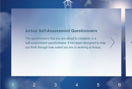
Airbus Self-Assessment Questionnaire
February 20th, 2012
Is it a bird, is it a plane, no it’s an Airbus! Just when you thought that the Airbus Programme Matcher couldn’t get any better, we created an online self assessment questionnaire for potential employees to undertake. If you don’t get to navigate an aeroplane, at least you get to navigate through their virtual survey. “The Wright Brothers created the […]
Article written by

84 tips on how to generate traffic for your website
January 23rd, 2012
Q: What is traffic? A: Traffic inadvertently means money, as that is what it equates to if executed wisely. It is in everyone’s interests with a business, to be educated in how to benefit economically. The amount of data sent and received by visitors to a website is classified as internet traffic. The number of visitors and […]
Article written by

Kraft Foods
November 21st, 2011
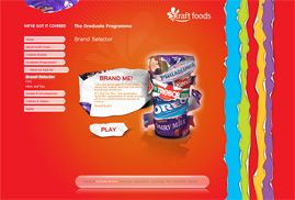
Digital Mosaic designed and developed the website for Kraft Foods to enhance their recruitment strategy, whilst creating a visual feast. Sadly, the position for food-tasting was not an option. ;o)
Article written by

Airbus Programme Matcher
November 10th, 2011
Reach new heights with Airbus Programme Matcher: I believe I can fly I believe I can touch the sky I think about it every night and day I spread my Airbus wings and fly away…
Article written by

Secret Santa
November 1st, 2011
Here at Digital Mosaic, we are excited to launch the new version of our Secret Santa website. It has been designed and developed to make your Christmas shopping easier and fun, by enabling users to create their own gift lists. Unlike other similar sites, it is unique in allowing you to suggest the presents that you would like to receive. This […]
Article written by

Chapter 6: Typography in Web Design – Interview with Grant Bowden
September 22nd, 2011
Typography Interview with Grant Bowden: Creative Director of Deep. Q: What excites you about typography? A: I could happily write about the never-ending beauty of the letterforms, the utilitarianism of Sans Serifs, the timeless sophistication of Serifs, the elegance of Script Lettering, the no-nonsense of slab serif, the aggression of Black Letter and the myriad of inbetweeners. […]
Article written by

Chapter 5: Typography in Web Design – Serif & Sans Serif Fonts, Typography as Art.
September 6th, 2011
Serif and Sans Serif Fonts Serif fonts such as Times, Georgia or Baskerville are used for large bodies of text as they are more distinctive, familiar and legible. Whereas Sans Serif fonts such as Ariel, Helvetica and Verdana etc. are more effective for low monitor resolutions and therefore applied to captions, headlines and logos. Serifs are distinguishable from Sans Serifs […]
Article written by

Chapter 4: Typography in Web Design – Hyphenation, Emphasis.
September 6th, 2011
Hyphenation Hyphenation in typography serves to connect words that are divided when they cannot fit comfortably at the end of typed lines. To avoid fragmented words, hyphens should be placed predominantly between consonants. A useful tip is to ensure that a hyphen is sandwiched between two letters on one line and three on the following line. Emphasis Emphasis is a […]
Article written by

Chapter 3: Typography in Web Design – Kerning, Tracking, Baseline, Leading.
September 6th, 2011
Kerning/Mortising, Negative/Positive Spacing-Tracking Kerning-also known as mortising, adjusts character spacing in proportional fonts for an aesthetically pleasing result. This is achieved via moving the letters closer together, otherwise referred to as negative spacing. Tracking or positive spacing on the other hand, moves the letters further apart. When a font is kerned correctly, the area of the two-dimensional blank spaces between each pair […]
Article written by

Chapter 2: Typography in Web Design – Space, Widows & Orphans, Alignment, Paragraphs, Measure.
September 6th, 2011
Space Allow your text to speak by having enough negative or white space to envelope it. Another web typography rule is to keep 140% of line spacing in relation to your font size, as specified by the line-height CSS property. In fact the attention to micro space within the type, is the mark of a good designer. Not only is […]
Article written by