Responsive Web Design
RWD – is an abbreviation of responsive web design and optimises the viewing experience for users by scaling down visuals, so they are cross compatible with an ever growing number of devices. This entails maximising the potential of any interface to meet spatial boundaries and to work effectively, whether displayed on computers, mobiles or tablets. The design criteria includes providing device friendly navigation, image and content resizing, easy reading, panning, scrolling, resolution and scripting abilities. Content is able to be adapted to different screen resolutions via Media Queries, which is a CSS3 module (cascading style sheets). The browser width is a common feature that designers focus on when devising responsive web. Another is page element sizing for fluid grids to determine the layouts. Image flexibility is also characteristic of RWD within 100% units so as not to exceed the element display.
With the demands of consumers evolving for so many new devices that are monopolising the technology market, designs now take into consideration content that resizes to fit when users shrink their browser. With smart phone apps fast becoming popular digital platforms, design agencies are required to extend their web services to them by creating mobile websites. Online sites behave differently when being presented in a smaller format. The responsive functionalities accommodating the display on different sized devices, can also be referred to as adaptive design in technical terms. Responsive web design enables audiences access to data across multiple devices. One example of this is when you view information on a desktop computer and then minimise your browser window. As the images and content are reduced, some of the design elements disappear. Subsequently, some homepages shrink to accommodate the details in other layouts. As such, what begins as three columns of content eventually resolves to two and finally one, also affecting the sidebar location.
Adobe’s Edge Reflow is a responsive design tool that creates the correct proportions for devices of omnifarious dimensions. This provides the various stages of the design layout process for adapting sites to mobiles, rather than an immediate solution. That way, digital designers can streamline the content for alternate display sizes. Hence, their designs can respond to their users needs by having one site for every screen.
Responsive design may have its disadvantages in terms of placing constraints on formats, they take more time to implement and it’s only worthwhile if a high ratio of your traffic is generated via your mobile device. A viable solution that works, entails utilising fluid grids that influence the design flexibility of fixed width images. That said, responsive design is still a useful tool considering the evolution of devices and in adapting the display for their different dimensions. Although this trend has been popular for a while in interactive design, the emphasis is on structure and content rather than style. It also increases web accessibility to everyone in all digital networking communities.

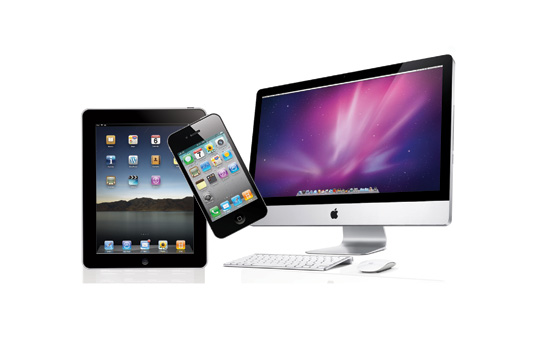
Responsive web design is not just about solutions that automatically adjust to accommodate screen resolutions on various sized technologies such as Kindle, laptops, computers, mobile phones, iPads and smart TV’s etc. It is also about a whole new way of thinking about design, given the sizing options for images and information. Landscape and portrait orientation is one aspect of designing for responsive web. Flexible layouts are now more common practise compared to column formatting of the past. The techniques for creating fluid grids and images lies in scaling foreground content with the layout, crafting sliding composite images and programming them to appear and disappear. To ensure the flexibility of images, is to use CSS max width at 100%. Therefore an image resized at its maximum width will be reduced to its relative display according to the browser. This is achieved with CSS once the width and height has been incorporated in the coding and then redirected via Javascript and html5. Also CSS Media Query enables the creation of style sheets by manipulating structural elements of the design. The difference between touch screen devices and those that navigate with cursors requires careful usability consideration when designing for responsive web.
The digital landscape is changing for touch interfaces, particularly phones. Aiming to future proof designs can only go as far as technology permits until it catches up with our inventive requirements. Inhabitant and structure now influence each other to create effective user experiences from design. The exchange between construction and information is accomplished on a graphics and development level. The media that renders these designs provides optimal viewing experiences for the wide array of emerging web devices, when combined with embedded standard based technologies like CSS3 after being applied to the mark up. When coupled with Media Query the resolution of the design becomes finely tuned. Mobile browsers that support Media Query include Mobile Safari, Firefox for Mobile, Blackberry and Opera Mobile to name but a few. Whereas desktop browsers that support it include Safari3+, Firefox3.5+, Chrome, Opera 7+, Opera Mobile and Microsoft’s IE9, (although the latter does not work with native implementation). Hence responsive web design requires the main ingredients of fluid grids, flexible images and Media Queries to achieve its purpose. Along with the creativity of thought to match the unfolding digital platforms of technology, the pliancy of design is explored further.
Responsive Web Design Examples: