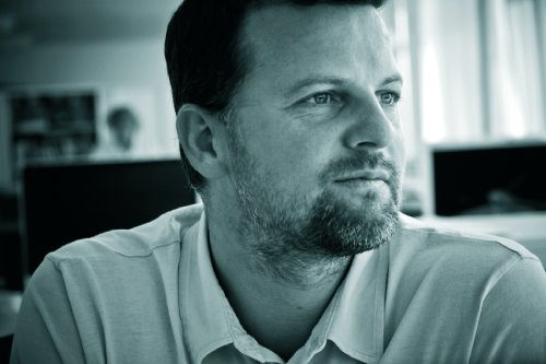
Chapter 6: Typography in Web Design – Interview with Grant Bowden
Typography Interview with Grant Bowden: Creative Director of Deep.

Q: What excites you about typography?
A: I could happily write about the never-ending beauty of the letterforms, the utilitarianism of Sans Serifs, the timeless sophistication of Serifs, the elegance of Script Lettering, the no-nonsense of slab serif, the aggression of Black Letter and the myriad of inbetweeners. I could write about the different ways different fonts can make you react to the same word, the way a message can be heightened just by the font it is written in, the way a brand is perceived by the typeface it is set in, and just how God damn powerful typography can be. I could write about the way the word STOP in capitals commands you to do something and you obey, the way Helvetica Medium, range left continually excites on FFFound.com, or even the way the word C*nt was so elegantly portrayed by a hand lettering artist.
I could write about Gotham, Chronicle or Tiffany or why any designer has three favoured fonts at any one time.
I could write about all these things. But at the end of the day its probably because I am such a nerd.
Q: Do you regard typography as an unrecognised art form?
A: Is it unrecognised? There are enough awards/advocates/students and fans of typography in the world.
Typography by itself is not art, but pure design – it has a function, a means and a purpose. Thats not to say it can’t dip its serifed toes into the stream of art and occasionally be part of that world and appear either brutal, beautiful or thought provoking.
Q: How do you transpose print typography to web typography?
A: Thank God we now can begin to, with font replacement and Typekit. The typographic hell that was the web is now being reined in and the move towards Apps gives the designer even greater control over the appearance of type. The real typographic challenge on the web (in HTML) is how to present type that can be increased or decreased in size at a whim by the user. Flash allowed typographic freedom but Apple iPads have temporarily put paid to that, but the web is excitingly becoming more expansive in its use of type. Interactive magazines on the iPad is a truly exciting development for typographers. In many ways we should not be trying to transpose print typography to digital projects, as one is static and the others excitement comes from its movement and dynamism.
Q: When and why did you develop an interest in the field of typography?
A: At college when I thought I was going to be a designer. Why? I think it was when we had a class in which we drew letterforms that I started to understand the inherent beauty in something so ubiquitous.
Q: What is the most important aspect of typography?
A: Freedom or constraint. Depends on the project, the client and the audience.
Q: Which typographer and typography work inspires you?
A: I think I have been influenced by many different designers, and my taste changes constantly so its hard to pinpoint anyone that has stayed consistent or I haven’t ‘grown out of’. But influences have been Adrian Frutiger, iD Magazine, 80s Dutch Studio, Vaughn Oliver, Octavo, Emigre, David Carson and more recently Vince Frost, The Partners, and the ever inventive designers in the Deep studio.
Q: What is your favourite typeface and why are you ‘font’ of it? ;o)
A: You should be ashamed. My favourite font is the next one I fall in love with.
Q: Where do you see the future of typography heading?
A: As communication hurtles towards more and more onscreen communication, typography has to follow suit and will be presented in a more animated and fluid way.
What will remain true is that a font which was carved into the Trajan columns two centuries ago, or a font designed by the minimalist Bauhaus will still have the same relevance in the future due to the feelings, emotions and memories it evokes.
Q: Is there anything else you want to add to this?
A: Can I go now?