Fontastic Typefaces
May 15th, 2015
The work of graphic designers often requires the use of fonts. These typefaces not only combine artistry with legibility but also convey meaning behind messages that are not just image based. A free service that provides an abundance of these fonts includes Google Fonts, with a selection of 650 different font families. However, not all fonts complement each other and as such, there is a compatibility table available displaying 400 pairings for typeface congruity. This infographic is a guideline rather than ipso facto. The colour code uses white for fonts that work well together, grey for an unlikely match and black for an unsuitable combination. When coupling typefaces, selection is based upon consideration of a heading (display font) and content for body/paragraph (text font).
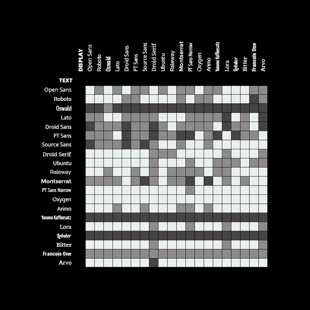
Picture: FastPrint.co.uk
When improving font performance, a free web typography app that is popular with digital designers is Typecast. Fonts.com has Dynamic Subsetting and Background Loading, providing a high standard of typefaces with their characters working optimally. This is particularly beneficial for Asian web fonts where current sizing adversely affects the speed of users sites. Additionally, loading speed for fonts in typography is increased by 30% courtesy of WOFF2 formatting. Also Endmarks in fontology are used to signal the close of an article, chapter or story.
The esteemed British romantic poet Lord Byron now has a font that represents his quill pen calligraphic style. This statement penmanship was developed by Cosimo Lorenzo Pancini for Zeta Fonts – an Italian digital typeface foundry. Nick Curtis is the father of New Foundry (Nick’s Fonts) which evolved from his passion for typography and is accessible via the font library. His font designs are inspired by art deco, art nouveau, retro, the Wild West and Jazz. Also his package and signage is influenced by Nostalgic 30’s and 40’s fonts, whilst others have revived phototypesetting fonts. His contribution to digital typefaces has progressed beyond exclusivity for graphic designers towards multi-media platforms, ranging from interface mobile devices to e-books.
 Picture: historicfontgeek.tumblr.com
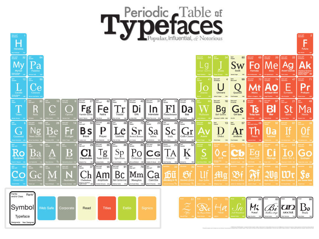
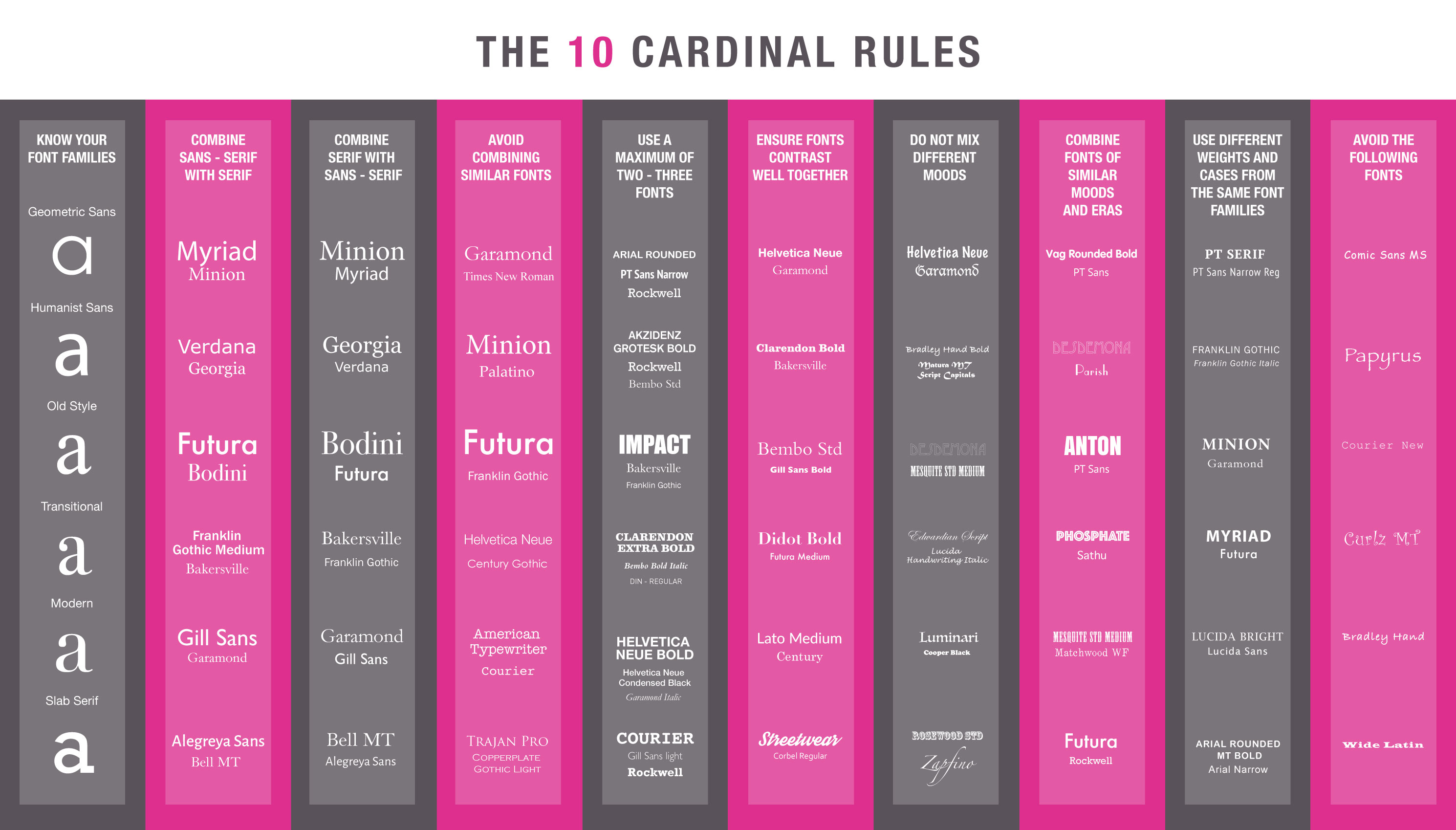
This periodic fonts table lists the most popular typefaces grouped by their class and family. Each cell also contains its symbol of one or two characters, its year of release, the designer and popularity ranking. Another guideline that designers consider when making typographical choices, is based on ten cardinal rules for fontology.
Picture: Digital Mosaic
Fontology has become an invaluable resource for graphic designers, introducing them to typography and conveying the crux of a message through instant visual communication. The vast selection of design fonts available, provides web designers with the ultimate tool in the creative process. The variety of typefaces utilised by digital and print designers, enhances concepts with inspirational and directional meaning. With such a wide range to choose from, fonts are an important factor in leading high profile campaigns and projects. From retro and romantic to experimental and corporate, the creative possibilities are endless in design.
Article written by
